Release Roundup: Summaries, a refreshed Imagery page, and more
You've probably seen our Series A funding announcement by now (ICYMI, we recently raised £10.7 million in a round led by Silicon-Valley based firms Altos Ventures and Footwork).
What does this mean for our customers? A lot of this investment will be going towards making our product even more epic. We’ll continue to build the best brand tracking solution on the market, providing brand leaders with actionable insights that make their jobs easier and give marketing a bigger seat at the boardroom table.
We’ll be making lots of quality of life improvements to our existing functionality along the way, but our big focus is on building new features that:
- Make it easier than ever to understand the key changes in brand health
- Tailor Tracksuit data to support brand builder’s key goals like reporting and strategy setting
- Use Tracksuit’s data across categories to benchmark and know what ‘good’ marketing looks like.
We’ve just dropped our first major release of 2024. Let’s dive into the juicy new features!
Sign up to Shorts
For fortnightly brand insights, stories and goodness that'll help you win (we promise).
Want the TL;DR? Here's what we've released 👇
- AI-generated text summaries to explain your Timeline data in simple terms
- More accurate brand association themes on the Imagery page, and easier access to verbatim responses
- An option to add data labels for individual data points on your Timeline to make charts easier to understand
- A way to see all conversion rates between funnel metrics for deeper analysis
- A split view of future and past milestones for easier monitoring of brand moments.
Brand legend, meet Summaries
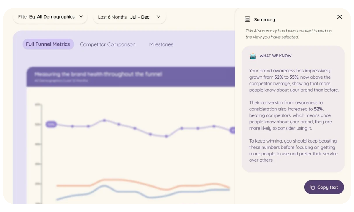
This one's a game-changer! With one click, you can now get AI-generated text summaries of your Timeline data that explain what’s happening in simple terms, ready to be copied straight into your report or presentation with our ‘copy text’ functionality.
Interpreting charts can take up time that busy brand leaders just don’t have, so this will be a real shortcut. In the words of one of our brilliant customers Helen Costello, Marketing Director at The Collective:
"I love this — these text summaries saved me a good 30 minutes on my monthly board report.”
Imagery page, refreshed
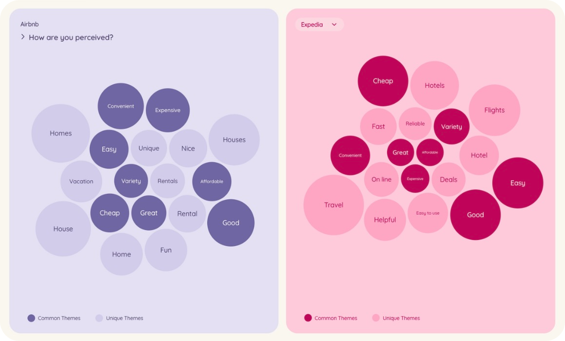
Imagery is a great source of insight, as it lets you see common themes associated with your brand and compare them to your competitors. And it’s just got better.
- The same data, but more accurate themes. We've done some smart data processing using a large language model (LLM) in the background to improve how we take raw responses and group them into themes.
- Raw data? Yes please! You can now click on a bubble and see a selection of raw responses associated with the theme. Plus, verbatim comments are still downloadable as a spreadsheet for further analysis.
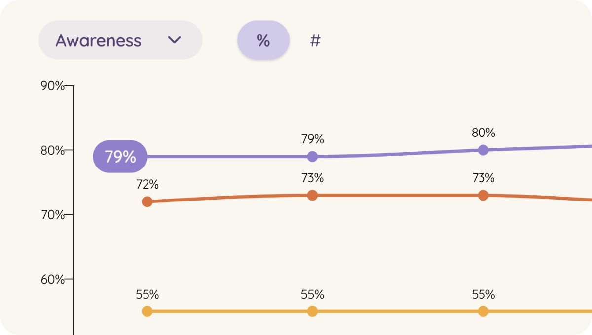
Add data labels to your timeline
You can now add data labels to your Timeline charts to show the exact values of individual data points – handy.
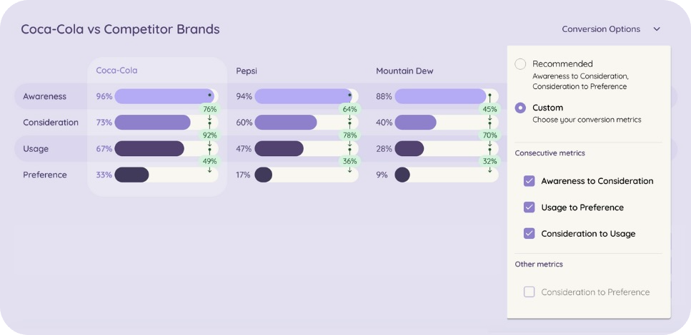
Measure conversion between all funnel metrics
We've added a new 'Conversion Options' dropdown in your Conversion Funnel that lets you choose which conversion rates you want to view, from all funnel metrics available to you.
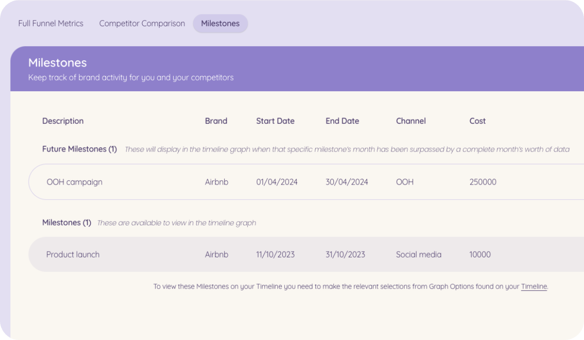
Keep track of future brand milestones
You can now add brand milestones and campaigns that will occur in the future and see them in a separate list so you don't lose track of what you've added. Future milestones will be visible on your Timeline charts only after the date has passed and a full month's data has been collected.
That’s a wrap
There’s heaps of new features to explore, so dive into your Tracksuit dashboard to get started! If you have any additional questions about these dashboard changes, reach out to your Brand Champion who will be more than happy to help you out.
